ORCA Reload Redesign
Reimagining the ORCA card reload experience
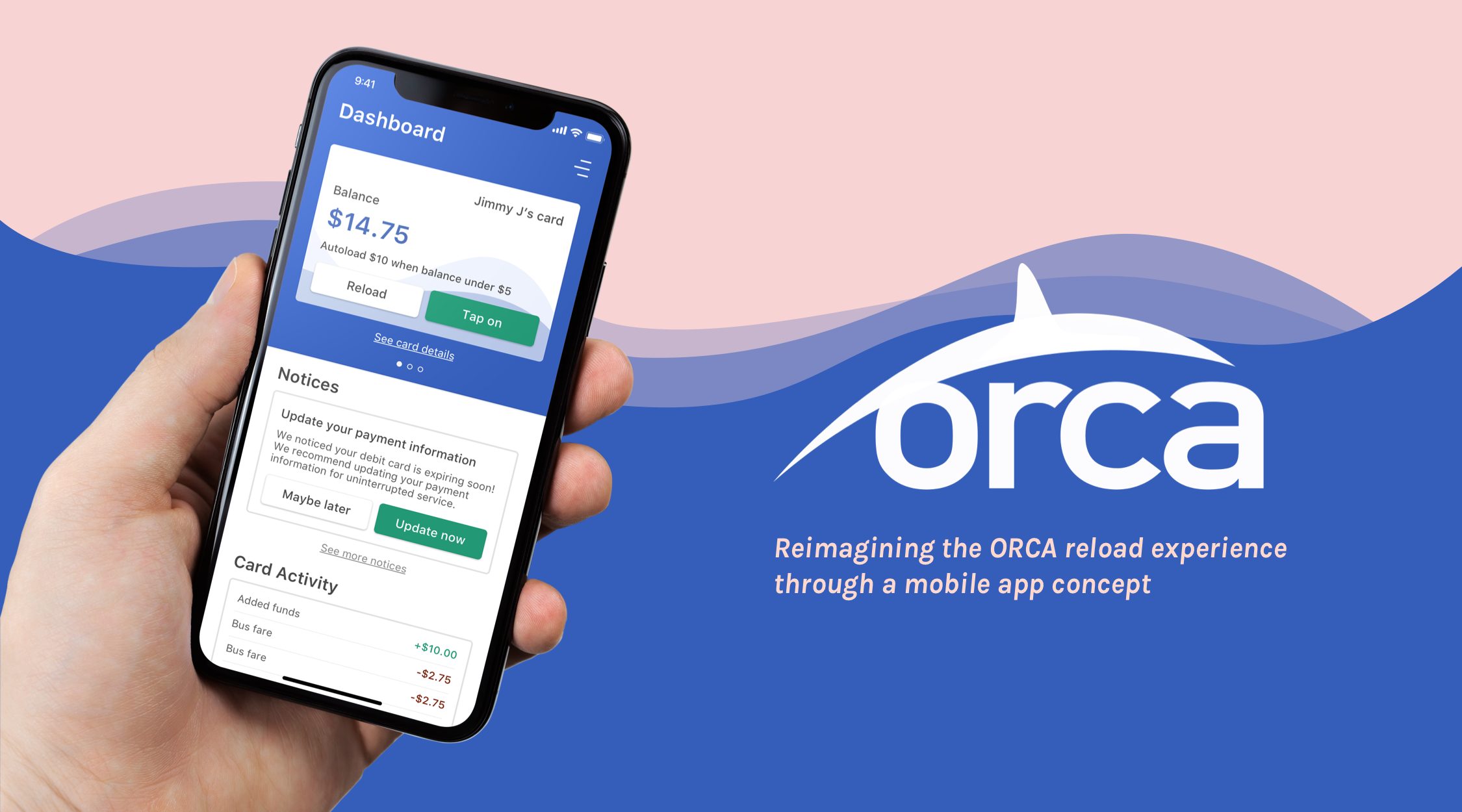
ORCA Card Reload in a Mobile App
Inspired by my experience and frustration with reloading my ORCA card, I re-imagined the card management and reloading experience on mobile.
For a personal project, I designed a mobile app experience to reload an ORCA card. I conducted UX Research (interviews, surveys, usability testing), UX & UI Design, and prototyping.
My goal was to create something from research to UI designs, fulfilling a user requirements.
Designed in July 2019.
Current Experience
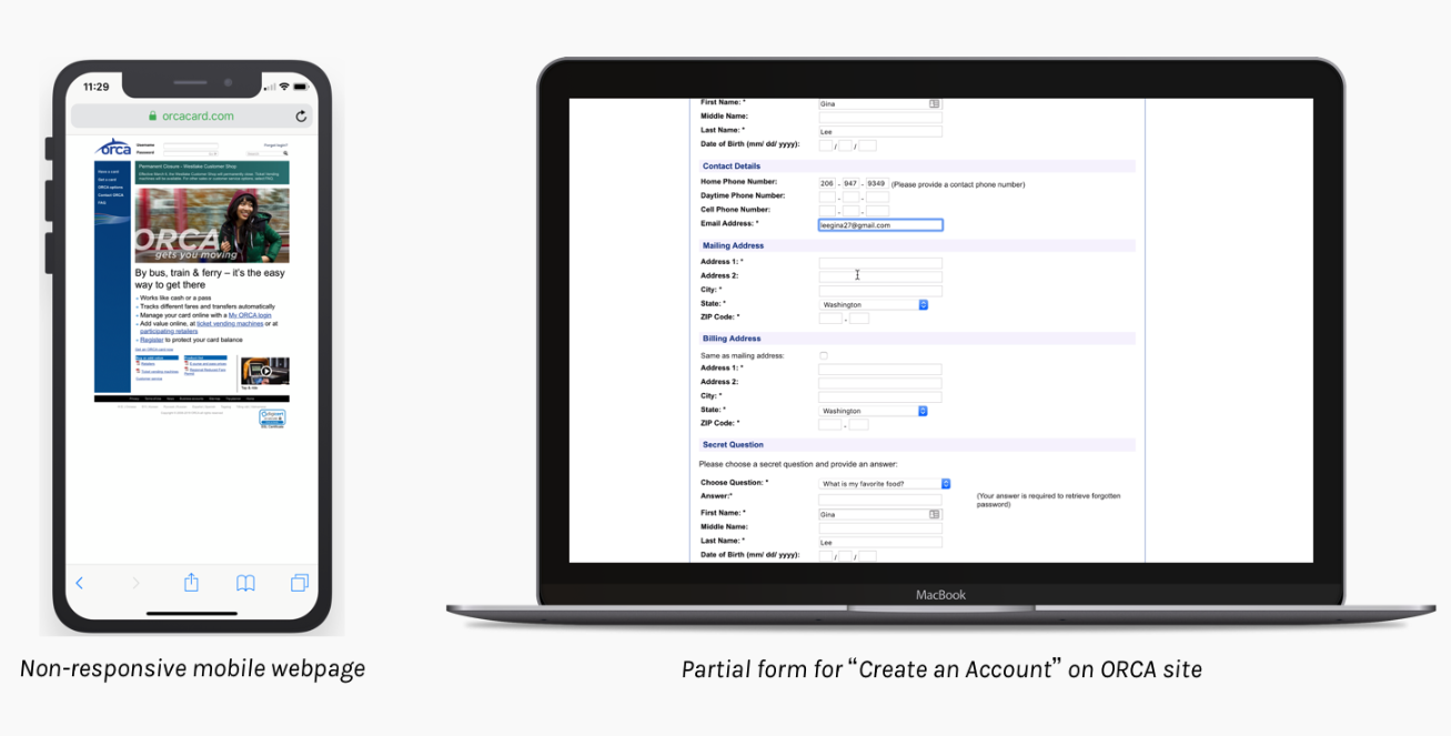
As of April 2019 the ORCA site was not mobile-web friendly and hadn't been re-designed since 2013.
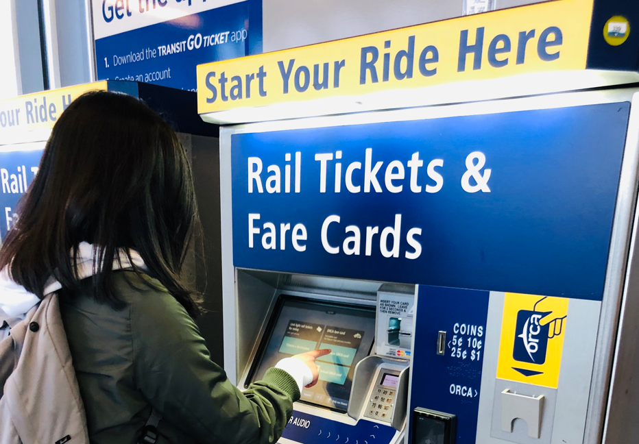
The site allowed users to reload money on the card, but it would take 3 business days to process. For instant reloads, users would have to visit the train station.
Driving Question
How can the ORCA reload experience be redesigned for semi-frequent and frequent users?
Process
Surveying ORCA Users
Out of 48 respondents who have used the site before,
- 58% use the site to refill their cards (second to vending machines),
- 63% of respondents check their balances on the site.
- Yet, 79% claim to visit the site infrequently (once a month or less)
ORCA’s website provides important, desired functionality, yet many users aren’t using the site as often.
Process
Site Evaluation
Overall, the site had outdated practices and designs. For example, the mobile webpage was non-responsive and there were complex forms to create an account or make a payment.
Process
Landscape Analysis
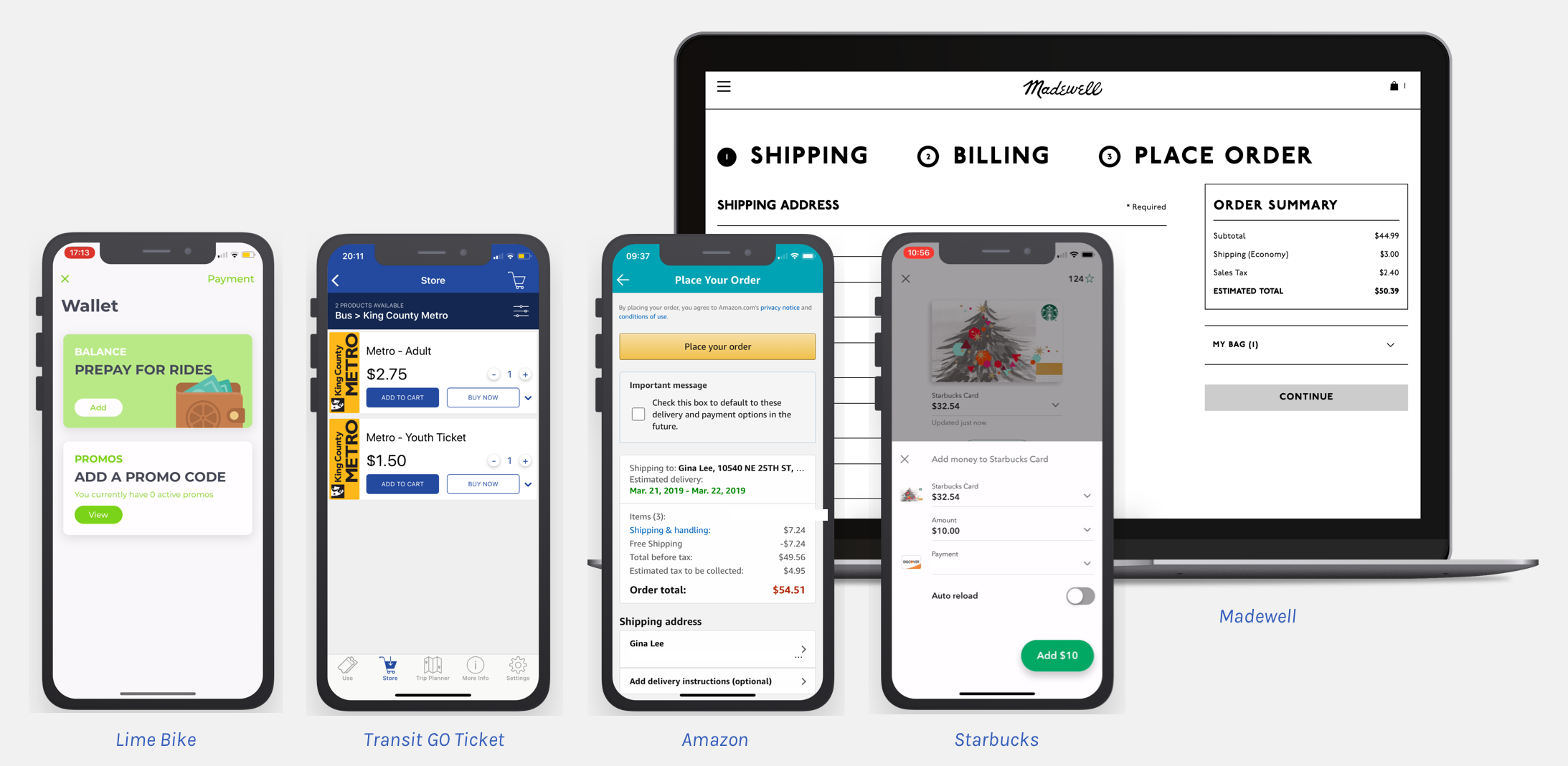
The reload experience will involve storing and making payments, so I found patterns for re-loading, adding payments, and completing complex orders.
I also looked at surrounding systems parallel to ORCA, like the Transit GO ticketing app and using cash. I found that these solutions didn't accommodate the recurring, local transit user.
The existing solution for instant money in the ORCA card revolved around the ORCA vending machine, which are located at a few major stations or loadable at grocery stores.
Process
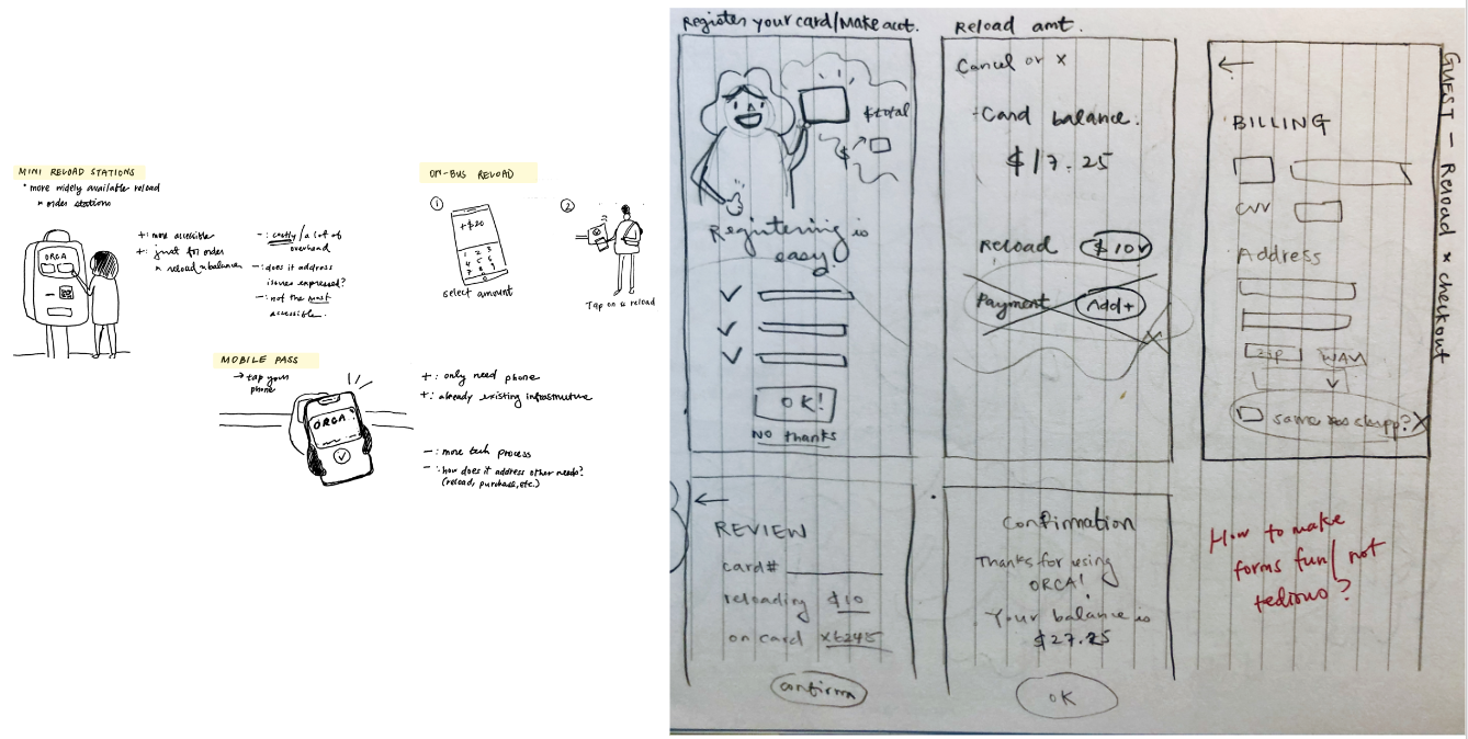
Ideation
With my findings, I thought of ways to address parts of the ORCA journey, like tap on (bus or light rail), reload, check balances.
For this case study, I decided to mock up a mobile app which would empowers users who are on-the-go and offers the same functions as ticket vending machine (reload a card, check a balance).
Process
User Flows & Wireframes
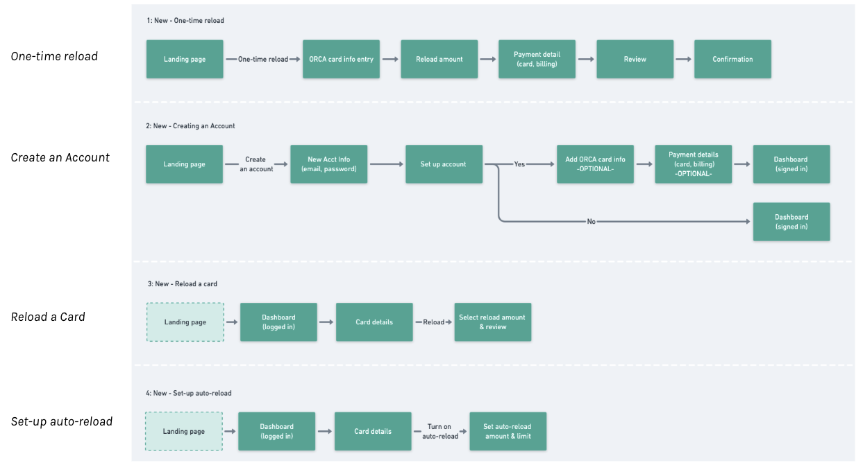
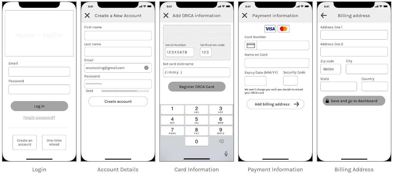
I explored 4 possible user flows based on user needs from the survey and capitalizing on existing processes. Based on those flows, I created a set of mock-ups to use during a usabilty test.
Process
Usability Test
I tested a clickable, wireframe prototype with a total of 7 participants (split across 2 rounds). From these studies, I found that
- People generally feel apprehensive about adding payment details, so payment details should be left for the end
- Functionality should be more discoverable and obvious
- Overall, the design needed clearer visual feedback
Based on feedback I received, I decided to move on to creating high fidelity designs.
Solution
ORCA Card Mobile App
Users can make a one-time reload, create an account to save their ORCA card and payment information for quicker re-loading, and check their balance.

One-time Reload
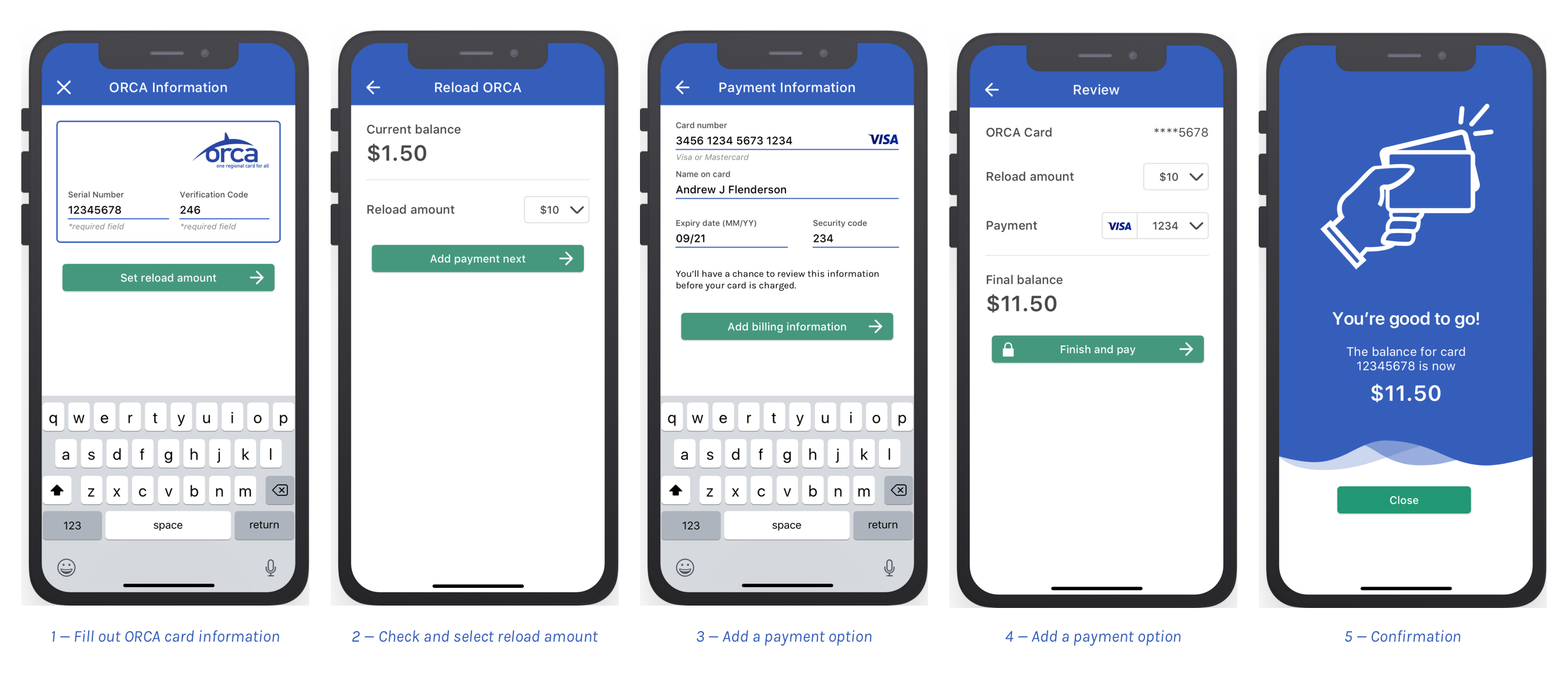
Some users may not want to create an account and just need to reload their ORCA cards. In those cases, I designed a One-Time Reload flow for users to add their payment information, similar to a Guest Checkout experience.
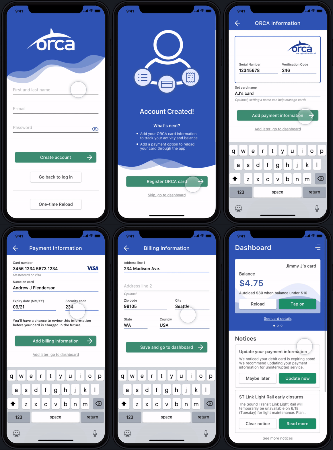
Create an Account
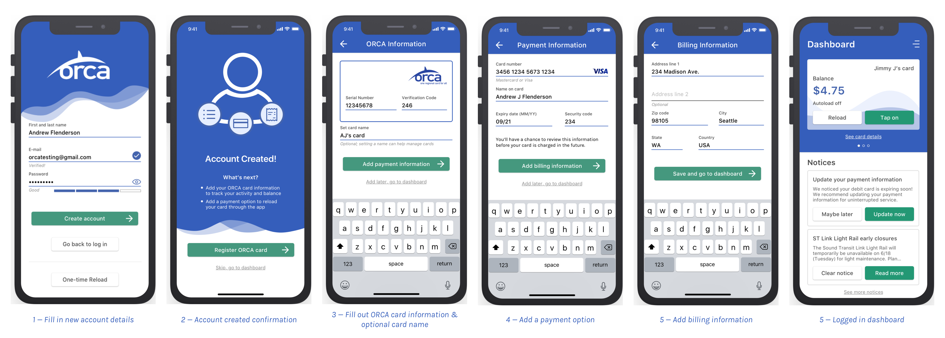
Once a user decides to create an account, they can choose to register their ORCA card and payment information.
Based on feedback that users don't want to add payment information until the end, I designed the flow to allow users to skip adding their ORCA card and payment information until they choose to reload their card in the app.
Reload a Card (signed in)
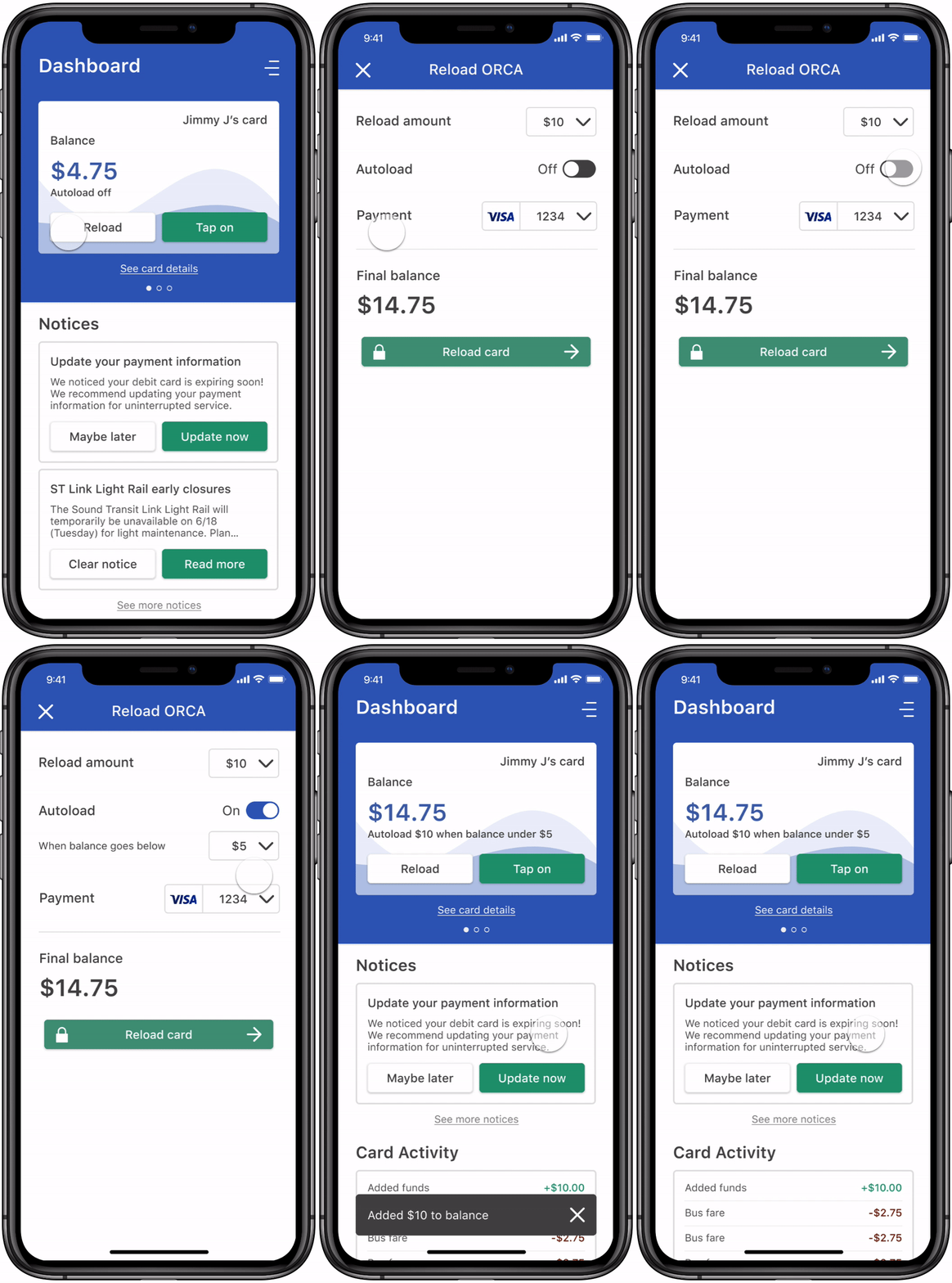
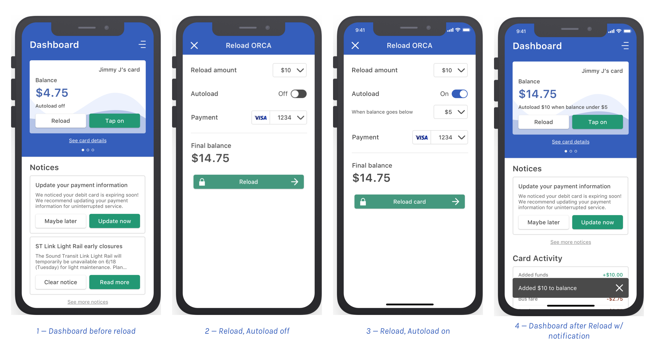
Users can reload their cards from the home page. Users can set a reload amount, turn on/off autoload when their balances get low, and change their payment methods.
Reflection
There are several things I would do differently now, but through this project, I learned about the value and importance of organizing my process, scoping a project, visual design and prototyping techniques, and running user research independently.
See my other work
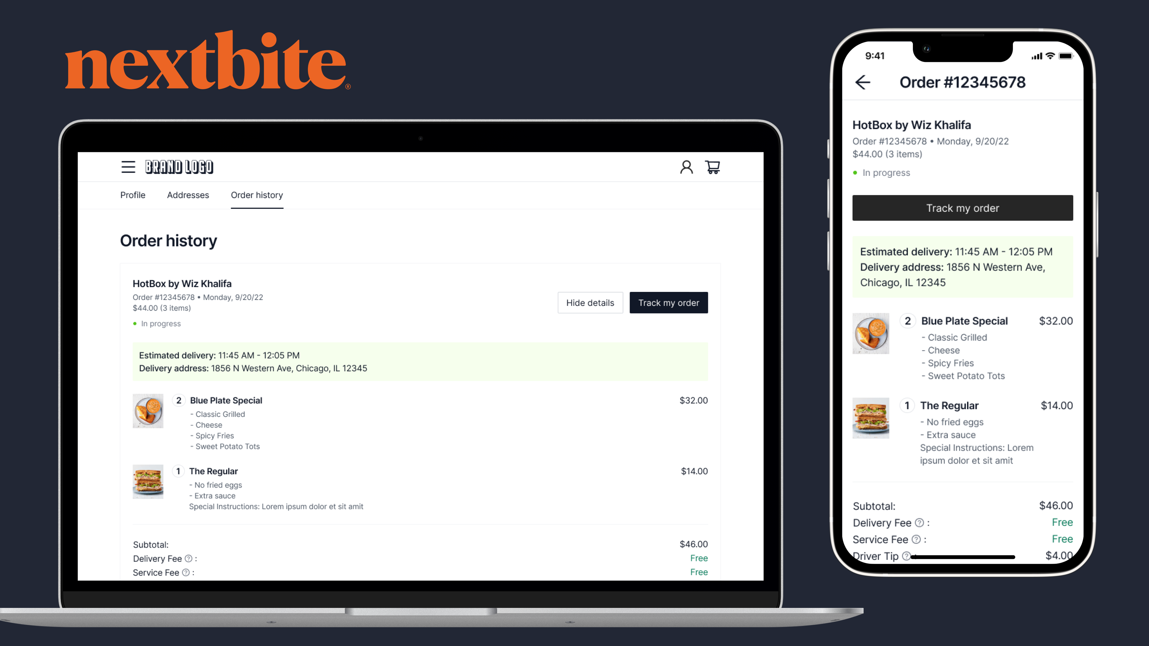
User Accounts for Nextbite's Direct-to-Consumer PlatformClient-facing, UX/UI Design
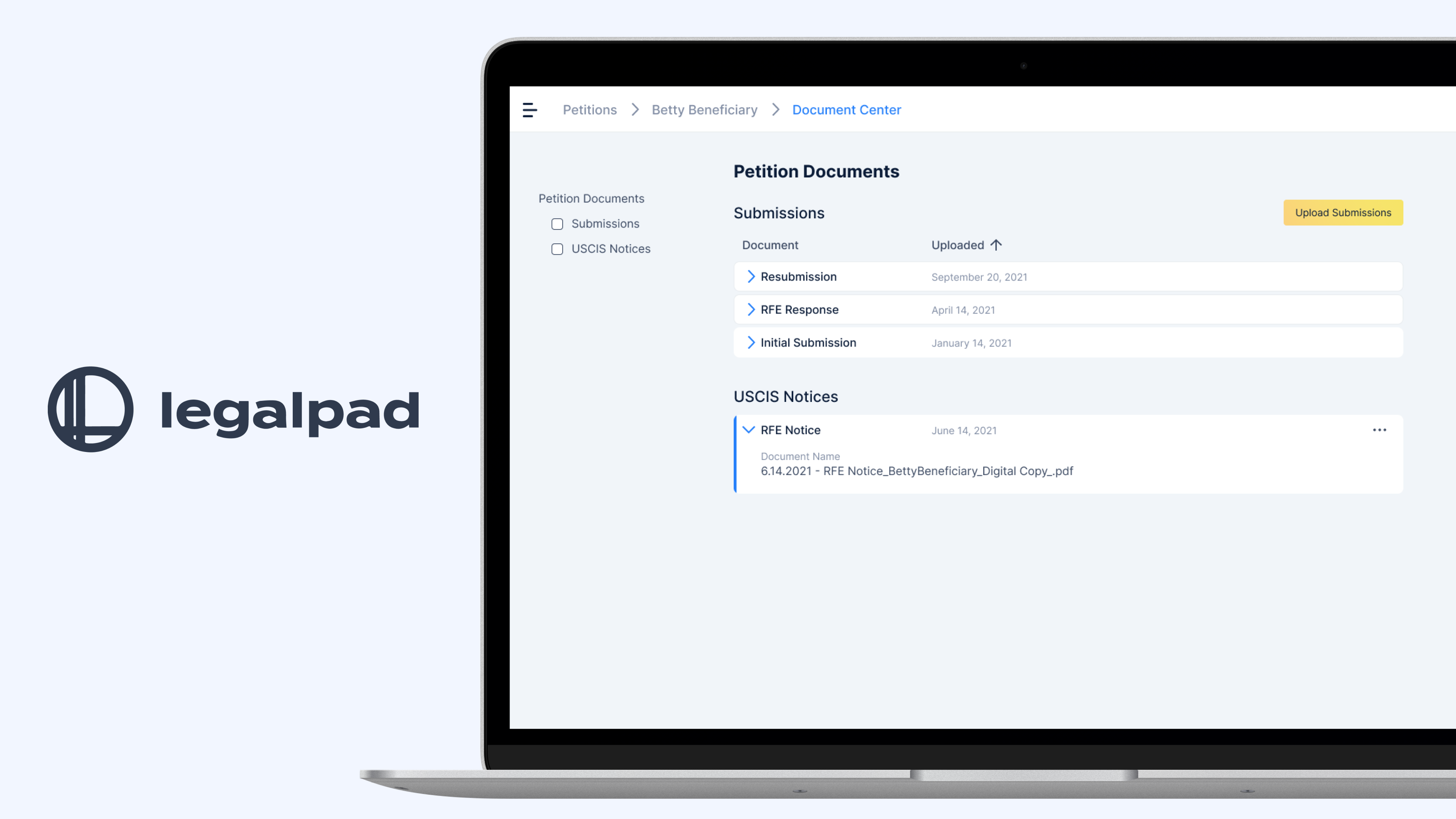
Document CenterClient-facing, UX/UI, UX research
